Wonder Conductor cohort starts 5th May 2026· 12 days left
Secure your spot →Brand Identity System
Sarah
Pirie-Nally
A complete guide to the visual identity, voice, and design principles that define the Sarah Pirie-Nally brand. Primary aesthetic: Warm Cream Editorial Luxe. Secondary undercurrent: Cosmic Technologist.
"Where Human Intelligence Meets AI — with Wonder, Warmth, and a Touch of the Cosmos."
Primary Palette
Warm Neutral
oklch(0.96 0.012 80)
Primary background — the canvas everything lives on
Deep Navy
oklch(0.12 0.025 265)
Primary text, dark sections, editorial weight
Hot Wonder Pink
oklch(0.56 0.30 350)
Headlines, main CTAs, impact moments — the signature colour
Magic Gold
oklch(0.76 0.17 85)
Sparkle moments, star accents, premium highlights
Secondary Palette
Wonder Rose
oklch(0.62 0.27 350)
Navigation, buttons, secondary accents
Soft Pink
oklch(0.82 0.12 350)
Tinted backgrounds, hover states, gentle highlights
Cream
oklch(0.98 0.006 80)
Card backgrounds, elevated surfaces
Gold Light
oklch(0.88 0.10 85)
Subtle gold tints, warm glow backgrounds
Cosmic Technologist Layer
Nebula Violet
oklch(0.44 0.14 295)
Cosmic accents — used sparingly on dark sections only
Deep Space
oklch(0.08 0.020 265)
Star-field backgrounds, deepest dark panels
Aurora Teal
oklch(0.78 0.14 185)
Data visualisation, tech callouts, constellation lines
Stardust
oklch(0.92 0.04 295)
Subtle shimmer on cream backgrounds — barely-there cosmic dust
Usage Hierarchy
The canvas. Backgrounds, cards, breathing room.
Typography, structure, editorial weight.
Accents, CTAs, sparkle moments. Never overuse.
Display / Editorial Serif
Cormorant Garamond
All headlines, hero text, pull quotes, book titles. The voice of wonder — elegant, literary, timeless.
Where Human Intelligence Meets AI.
Weights
Size Scale
Body / UI Sans-Serif
DM Sans
Body copy, navigation, labels, buttons, captions. Clear, modern, approachable — the everyday voice.
AI Strategy · Keynote Speaker · Author
Weights
Size Scale
Type Hierarchy in Action
AI Strategist · Keynote Speaker · Author
Where Human
Intelligence Meets AI.
Sarah Pirie-Nally helps leaders, organisations, and teams harness the power of AI without losing what makes them irreplaceable — their humanity.
Brand Voice Essence
"The brilliant big sister who's figured out the future — and can't wait to share it with you."
Warm & Direct
Speaks like a trusted friend, not a consultant. Cuts through jargon without dumbing down.
Curious & Energised
Leads with wonder. Every topic is an invitation to explore, not a lecture to endure.
Grounded & Credible
Evidence-based, globally experienced, 20+ years of real-world impact behind every claim.
Playful & Sharp
Wit lives alongside wisdom. A Clueless reference can sit next to a board-level insight.
Human First
Technology is always in service of people. The human story is always the headline.
Do Say
✕ Don't Say
Always real photos of Sarah — no AI-generated likenesses
Warm, natural light — golden hour, soft indoor light
Cream, white, or soft neutral backgrounds preferred
Sarah looking engaged, joyful, or thoughtfully confident — never stiff
Lifestyle contexts: speaking stage, cafe with laptop, Bali, home office
Pink blazer, white blouse, and glasses series are the signature looks

Hero — open joy, arms crossed

Signature glasses series
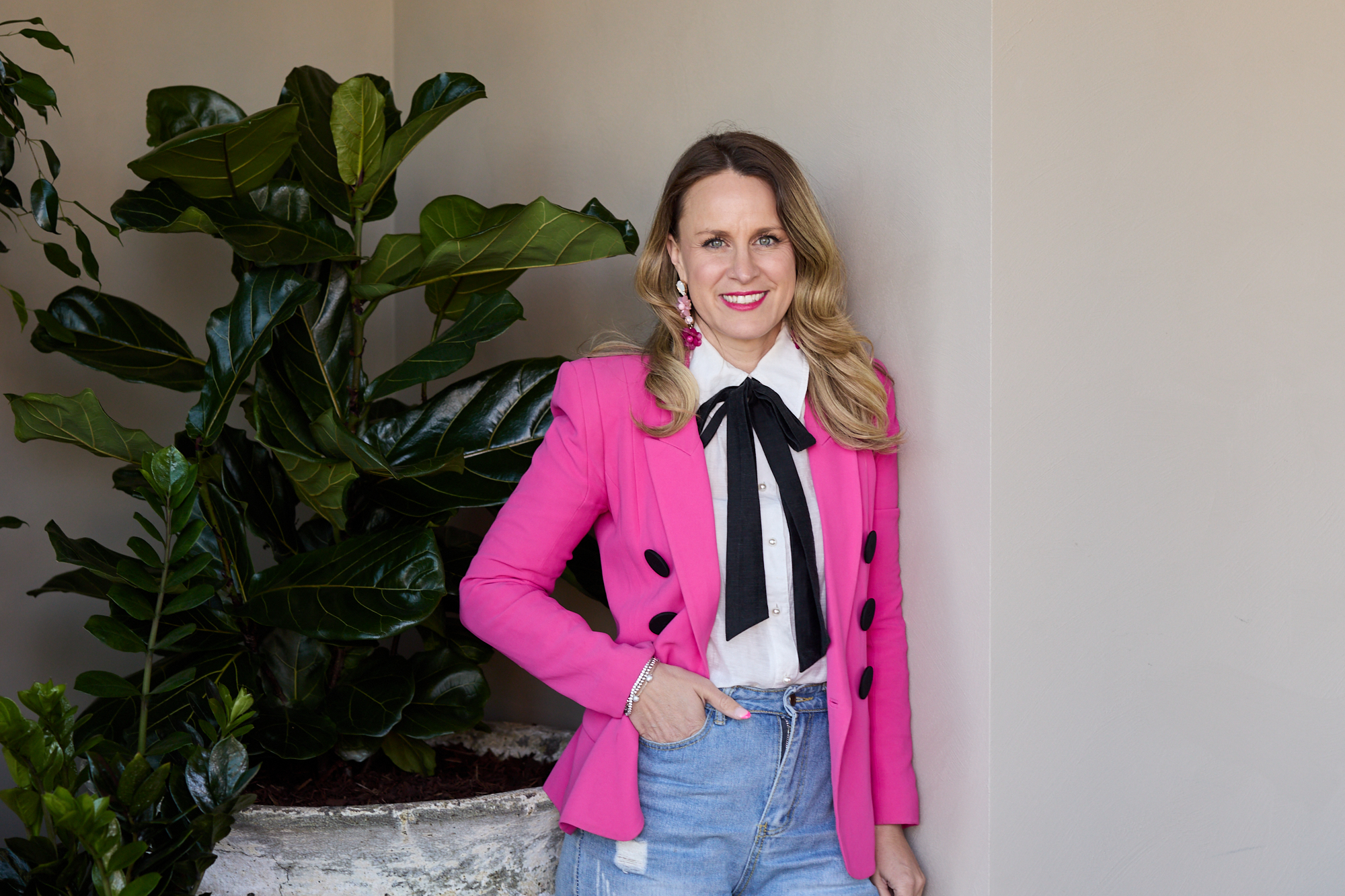
Pink blazer — brand colour
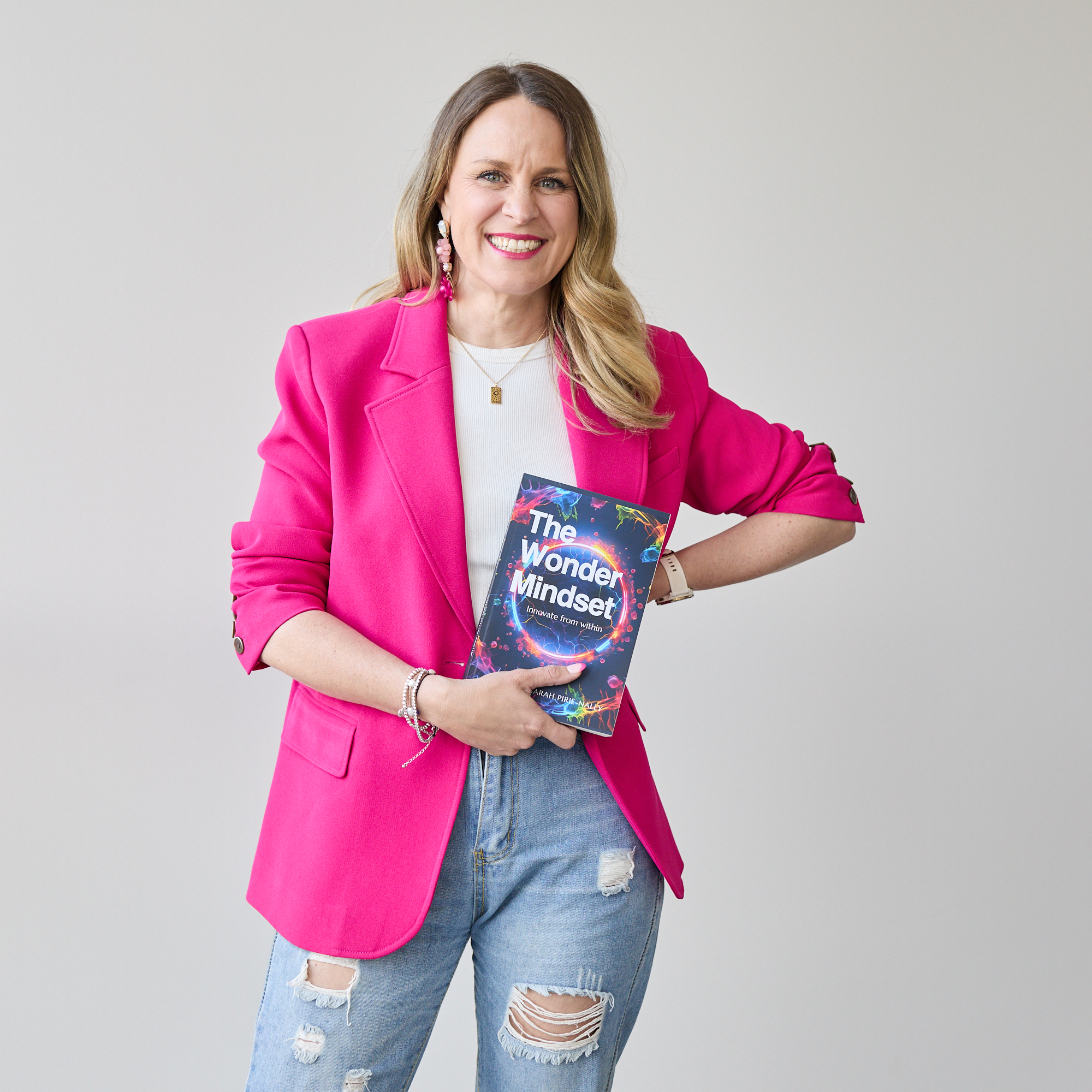
Author identity

On stage — keynote
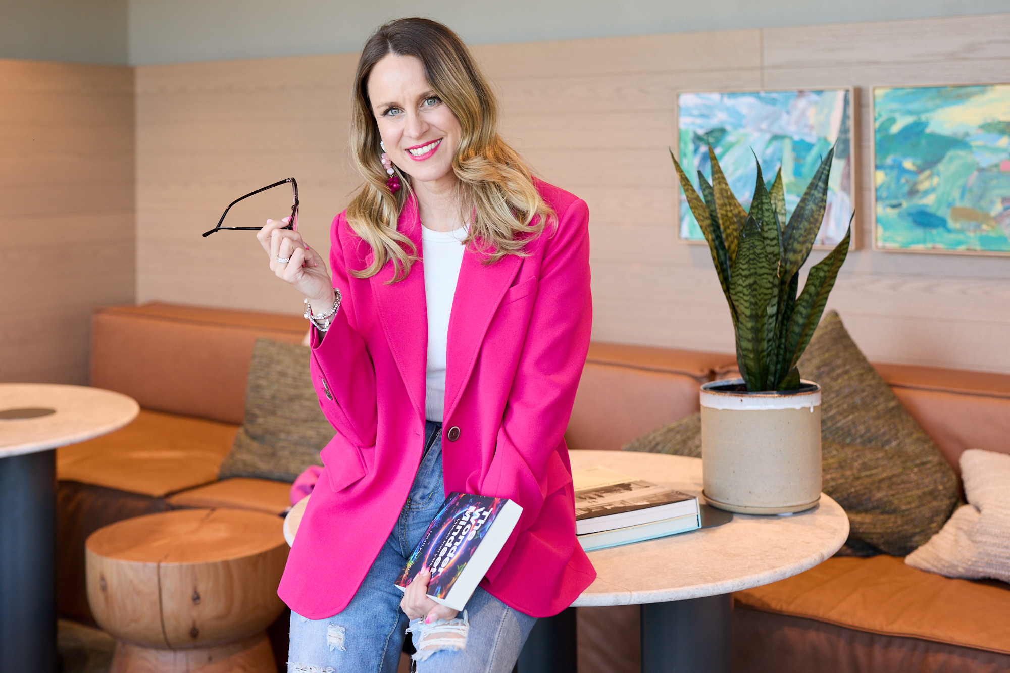
Lifestyle — cafe & book
Use cosmic colours ONLY on dark navy/deep space backgrounds — never on cream
Star-field textures are a whisper, not a shout — max 8% opacity on backgrounds
Constellation dot motifs replace standard bullet dividers in dark sections
Aurora teal is reserved for data, tech callouts, and AI-specific content
Nebula violet appears only as a glow or gradient accent — never as a solid fill
The cosmic layer should feel like you're looking at the universe through a cream linen curtain
Nebula Violet
#7B5EA7
Deep Space
#080D1A
Aurora Teal
#2DD4BF
Stardust
#E8E0F5
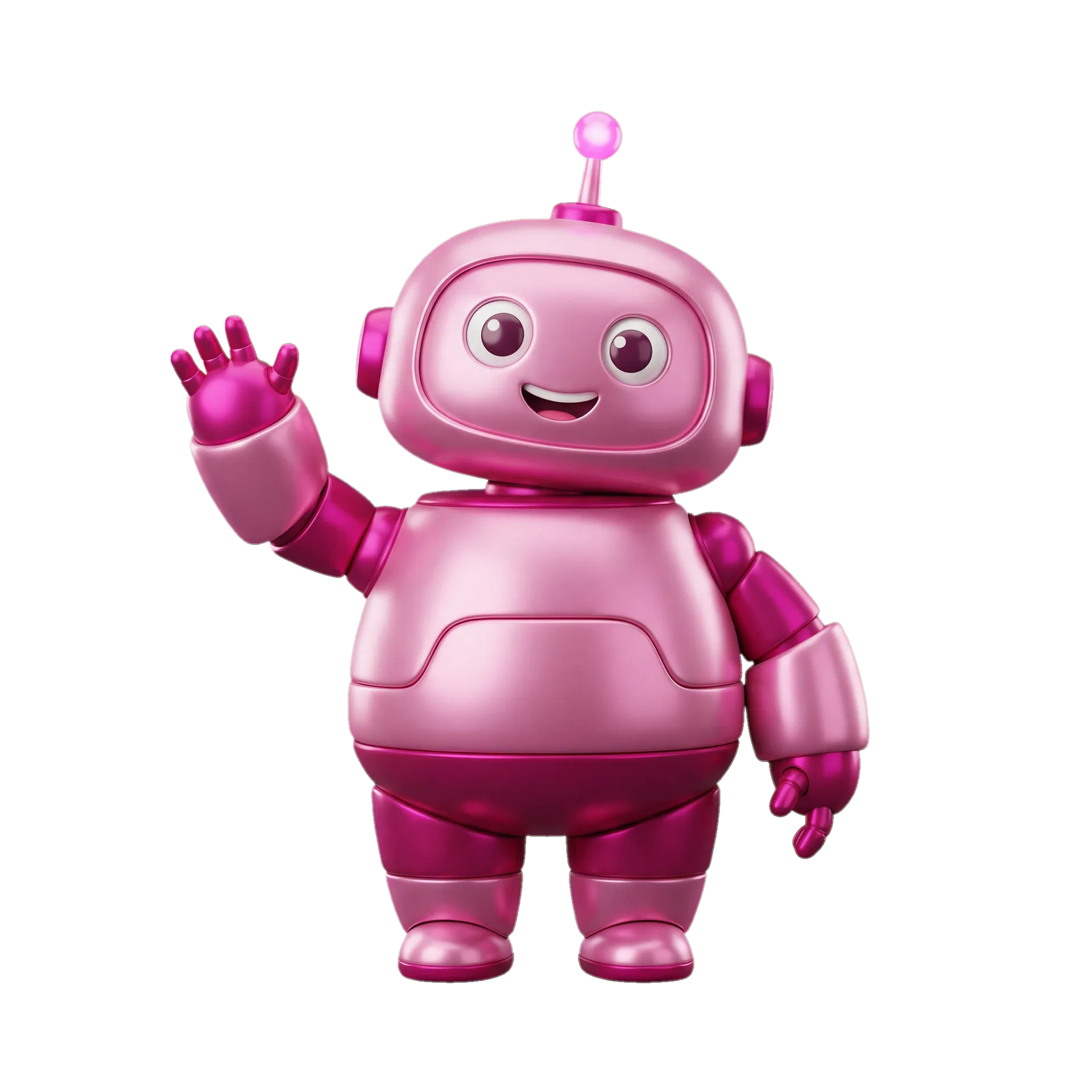
The Wonder Mascot
The AI robot mascot represents the playful, approachable side of technology — Sarah's belief that AI should feel like a helpful companion, not a threat. Used in hero sections, email footers, and social content.
Always shown with the pink glow drop-shadow. Never flat or grey.
Always use on cream, white, or deep navy backgrounds
Minimum size: 120px wide in digital, 30mm in print
Clear space: equal to the height of the 'S' on all sides
Never place on busy photographic backgrounds without a solid backing
Never stretch, rotate, or alter proportions
Never use coral, orange, or green as brand colours
Never use the logo in grey or desaturated form
Section padding
py-24 md:py-36
Standard section vertical rhythm
Container max-width
1400px
Maximum content width
Grid gap
gap-12 md:gap-24
Two-column editorial grids
Card padding
p-8 md:p-10
Content cards and panels
Border radius
0.25rem (4px)
Minimal — editorial, not bubbly
Pink rule width
2.5rem × 2px
Horizontal accent line before labels
Editorial Grid — Two Column
Image / Visual
Section Label
Headline in
Cormorant
Body copy in DM Sans. Clear, warm, direct. Never more than 3 lines before a break.
Questions about the brand? Ask Pip.
Pip knows the full brand system and can guide any design or content decision.
Made by Sarah Pirie-Nally and Manus AI